Nº8

Nº8

Nº8

Nº8

ECOMMERCE GLOBAL REDESIGN

ECOMMERCE GLOBAL REDESIGN

ECOMMERCE GLOBAL REDESIGN

ECOMMERCE GLOBAL REDESIGN

2018

2018

2018

2018

GORE-TEX Global eCommerce

GORE-TEX Global eCommerce

GORE-TEX Global eCommerce

GORE-TEX Global eCommerce

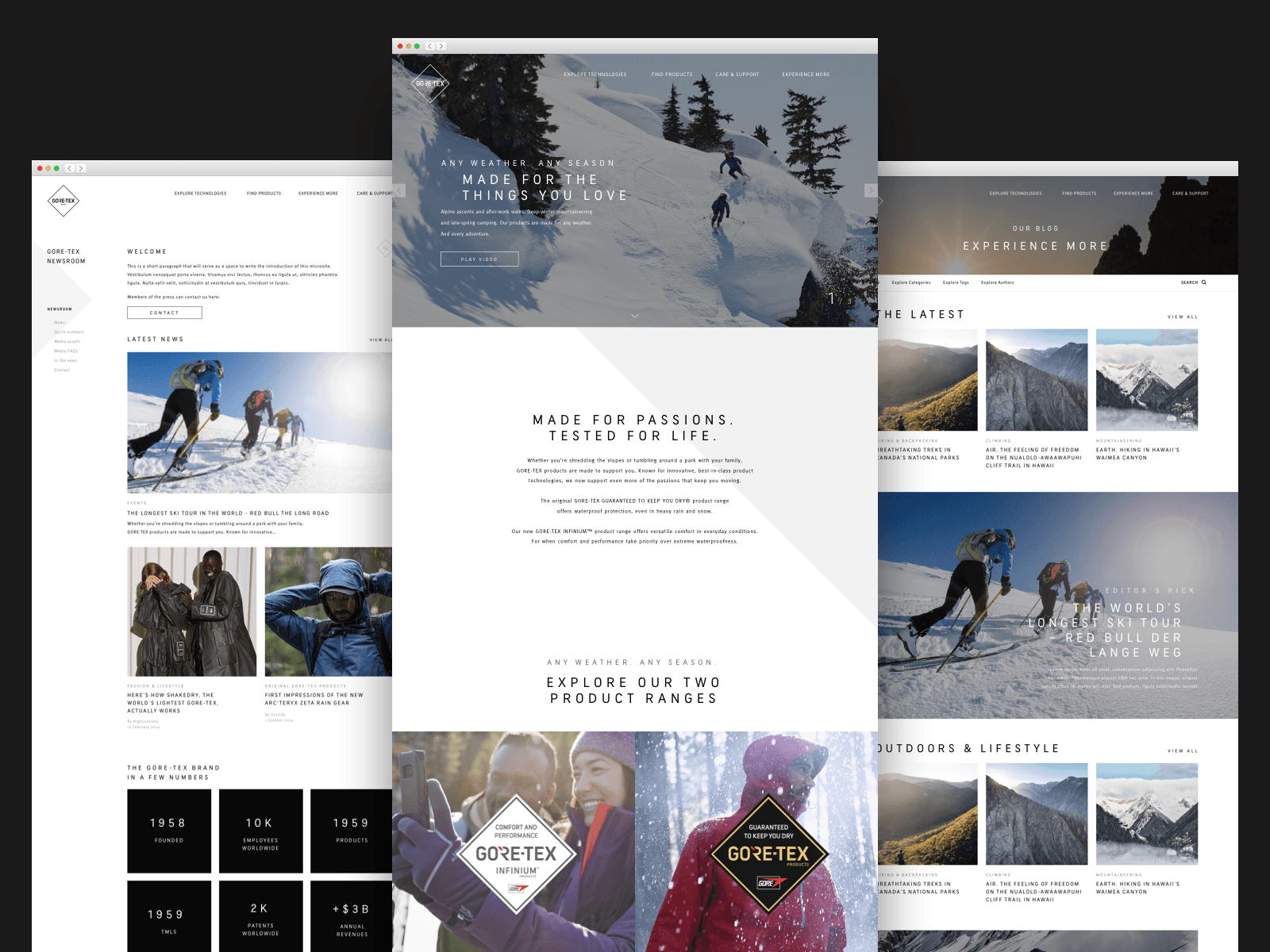
With a new product range, GORE-TEX INFINIUM™, the GORE-TEX brand needed a strategy to communicate the new range and required a global redesign to have a new branded presence across 11 markets. Not only did our team redesign their entire eCommerce, but created a new campaign that redefined the brand to is core.

EXPERIENCE PRINCIPLES

Enlightening

Raise awareness of the new range and transform the brand perception of GORE.

Scalable

Build an experience that's easy to expand across markets and future releases.

Intuitive

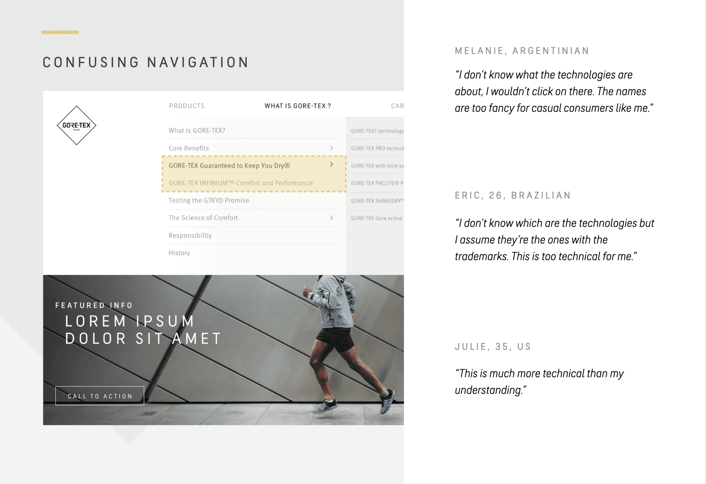
Discover products the easiest way possible and avoid overly technical language.

INDUSTRY

Retail

ROLE

Lead UX Designer

YEAR

2018

TEAM SIZE

10+

Challenge

GORE's unique selling point lies in its cutting-edge science. However, explaining the technical details of their products can sometimes confuse users about how they can actually use them in real life. While GORE-TEX gear is perfect for keeping you dry during intense sports, the new GORE-TEX INFINIUM™ range is more geared towards everyday activities with its water-resistant features. Our challenge was to effectively communicate the strengths of these products in a user-friendly manner, and guide customers through the online store to make informed choices based on their needs and preferences.

Role

As the Lead UX designer, my role was to plan and execute a UX strategy, redefine the overall architecture of the site, map out all the user flows, benchmark against competitors, prototype and test with users the new experience, and collaborate with strategists, brand team and designers to implement the new vision across different platforms.

Solution

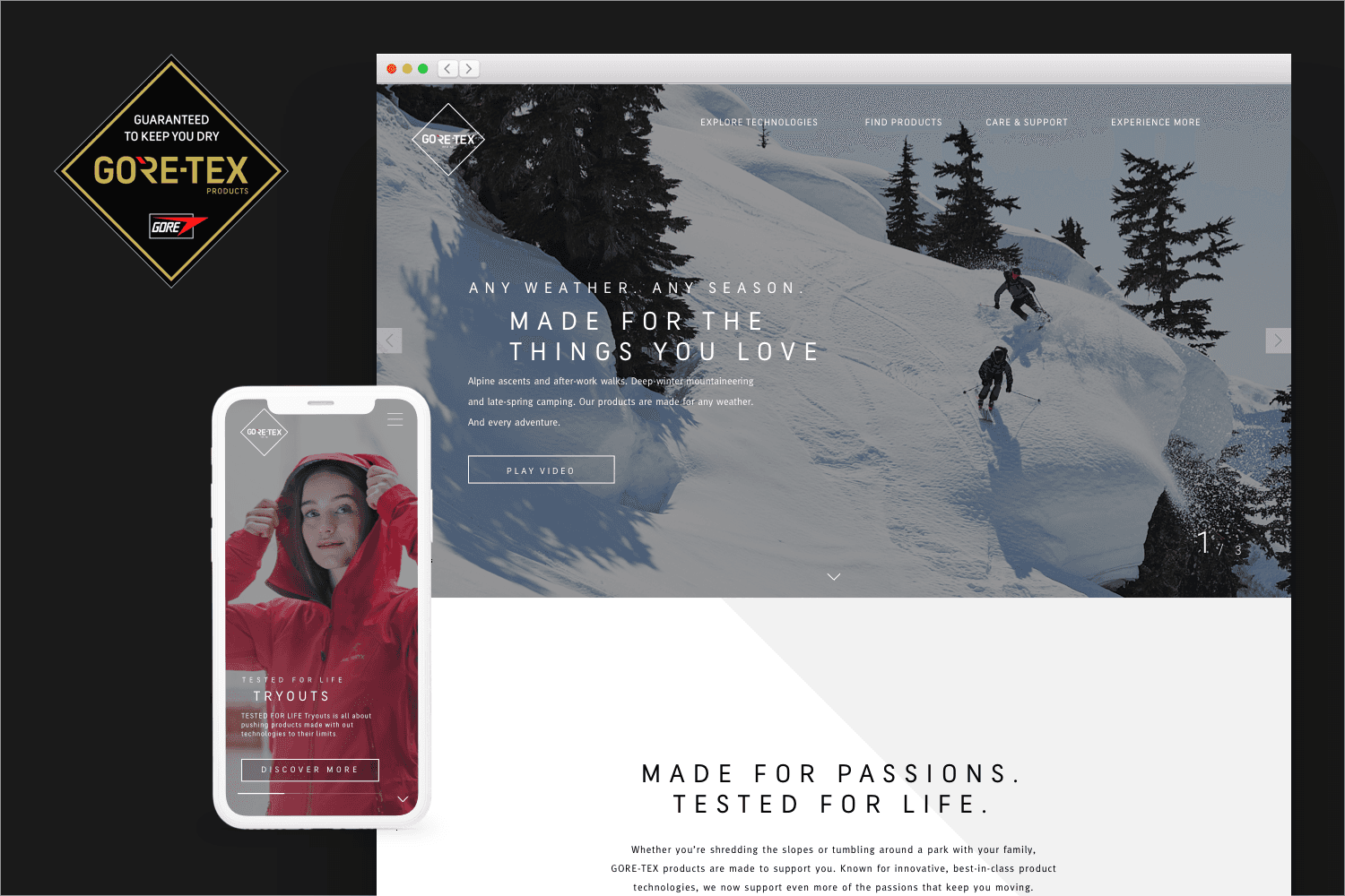
The AKQA team came up with the campaign "Tested for Life", delivering the whole strategy, messaging and assets for multiple channels including the website I worked on. The outcome was a seamlessly integrated experience, from the first time you saw an ad on social media, to the purchasing funnel experience on the website. The campaign and website raise awareness and transform the perception of GORE-TEX by drawing them deeper into "Tested for Life" experiences, collaborations, influencer stories and feature GORE-TEX and GORE-TEX INFINIUM™ products. The revamped GORE website effectively translated its unique innovations into user-friendly products tailored for everyday people and athletes alike. Stealing a quote from the campaign: "When life tests you to the limit, you need to know the jacket on your back, has your back."

A consistent experience across all channels and regions

140+

Pieces of content

11

Countries

745k+

Monthly visits

We understood users didn't care about technologies

We understood users didn't care about technologies

But about what they could do with them

But about what they could do with them

PROCESS

01

Research & Analysis

Used GORE's prior research, ran usability tests, and analyzed their analytics to understand the user pain points and needs. Additionally, we studied competitors and industry trends to gather insights.

02

Information Architecture

We conducted user interviews, surveys, and analyzed in-app analytics to understand the pain points and user needs. We also studied competitor apps and industry trends to gather insights

03

Wireframing & Prototyping

We conducted user interviews, surveys, and analyzed in-app analytics to understand the pain points and user needs. We also studied competitor apps and industry trends to gather insights

04

Usability Testing

We conducted user interviews, surveys, and analyzed in-app analytics to understand the pain points and user needs. We also studied competitor apps and industry trends to gather insights

05

Design System & Handoff

We conducted user interviews, surveys, and analyzed in-app analytics to understand the pain points and user needs. We also studied competitor apps and industry trends to gather insights

Thank you to my team Rose, Ana, Aniana, and so many more involved in this huge project.